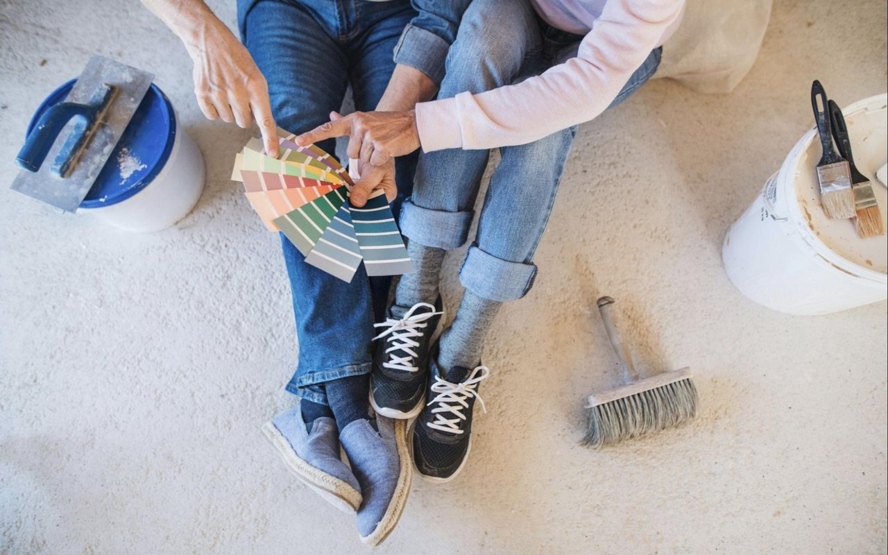
Color is one of the most transformative design tools you can use in your home. It affects how you feel the moment you walk through the door, whether that’s calm, energized, inspired, or comforted. In a setting like Carmel-by-the-Sea, where ocean views, rugged cliffs, and historic charm come together so naturally, color psychology becomes especially meaningful. Every hue you select can either echo the town’s coastal ambiance or create a striking contrast that gives your interiors personality.
The colors you live with are more than decorative; they shape your mood and behavior. Soft, muted tones tend to encourage relaxation and mindfulness, while rich, saturated shades can spark creativity and conversation.
Think about how you want each room to feel before you pick up a paintbrush. The psychology behind color gives you the power to turn intention into atmosphere. Do you want your living room to feel bright and open, your bedroom tranquil, or your kitchen lively and social? When you understand the emotional response color evokes, you can design every corner of your Carmel home with purpose.
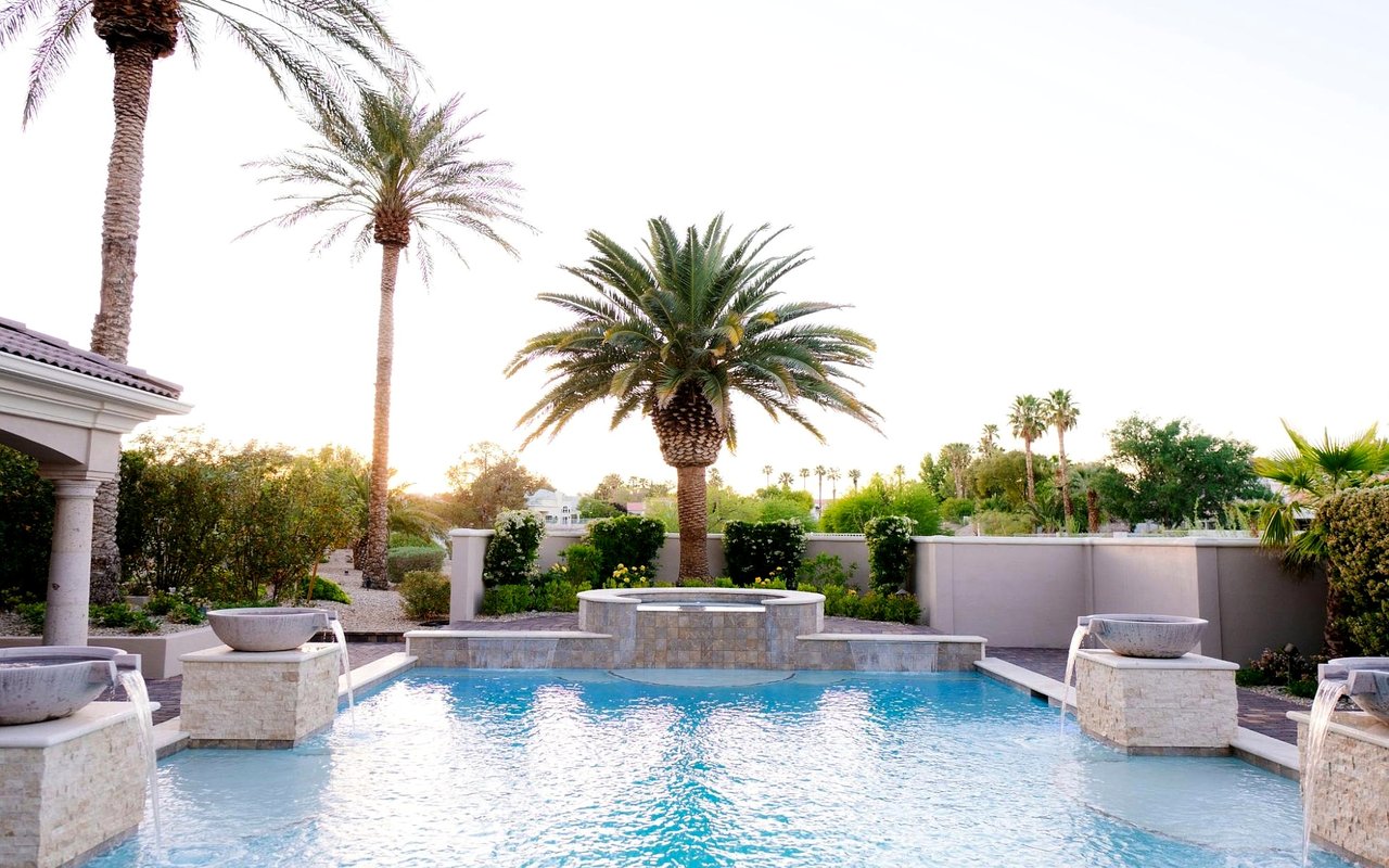
Carmel-by-the-Sea’s distinctive character—a mix of fairytale cottages, ocean breezes, and art galleries—naturally invites a color palette inspired by the environment. The key is to use that inspiration thoughtfully. Blues, greens, and sandy neutrals can mirror the coastline, while warm earth tones might recall the cliffs and trails just beyond the beach. Once you connect each color to an emotion and a local influence, you create harmony that feels personal and perfectly aligned with the setting.
Creating a Coastal-Inspired Palette That Reflects You
When you think of Carmel-by-the-Sea, the first images that come to mind are often the sea spray, sunlit cottages, and winding lanes framed by cypress trees. Translating this into your color scheme means balancing natural hues with personal taste.
A coastal-inspired palette doesn’t have to be limited to blue and white; it can include a whole spectrum of soft greens, warm taupes, creamy beiges, and even muted coral tones. The goal is to design a space that feels effortlessly connected to the environment while staying true to your own style.
Start by considering the light in your home. Coastal sunlight in Carmel is crisp and cool, so colors may appear slightly different throughout the day. Pale shades will appear airy in natural light, while darker tones can create cozy depth in the evening. In rooms with large windows or ocean views, cool tones like sea glass green or misty gray can complement the scenery. In smaller, shaded spaces, warmer neutrals or honeyed creams bring in a comforting glow.
You can also layer colors inspired by the coast in subtle ways. For example, pair soft blue-gray walls with natural wood accents and ivory textiles. Add touches of navy in decor or upholstery to create visual rhythm. If you prefer a slightly bolder statement, experiment with oceanic teal or sunset coral as accent colors; they evoke emotion while still feeling grounded in the coastal setting. By curating a palette that mirrors the surrounding landscape, your Carmel home will feel connected to its place without feeling overly themed.
The Psychology Behind Popular Coastal Colors
Each hue has a unique psychological influence, and when you live in a place as naturally inspiring as Carmel-by-the-Sea, the emotional connection to color becomes even more powerful. Understanding what each tone communicates helps you create rooms that not only look cohesive but also feel right for their intended purpose.
Blues are often associated with calm, trust, and openness. In your home, lighter shades like sky blue or powder blue can create a peaceful atmosphere, perfect for bedrooms or bathrooms. Deeper blues, such as navy or indigo, lend a sophisticated feel and work beautifully in living areas or studies. Blue naturally reflects the hues of the Pacific Ocean, grounding your home in its coastal surroundings.
Greens evoke renewal and balance, ideal for spaces where you want to feel refreshed. Sage, olive, or seafoam tones pair beautifully with natural materials like rattan or reclaimed wood. Green also bridges the indoors and outdoors — particularly meaningful in Carmel, where the line between the two often feels blurred by lush gardens and ocean views.
Neutrals — such as sand, cream, or warm gray — offer a calming foundation for any design style. They make spaces feel open and timeless, and they give your eye a place to rest between bolder accents. In color psychology, neutrals convey stability and serenity, qualities that make them ideal for communal areas where relaxation and connection are the goal.
Warm tones, including soft terracotta, muted peach, and subtle coral, can add vibrancy without overwhelming the space. They bring a gentle warmth that balances the cooler coastal hues. Use these shades sparingly in artwork, throw pillows, or accent walls to create energy and interest.
Using Color to Define Each Room’s Purpose
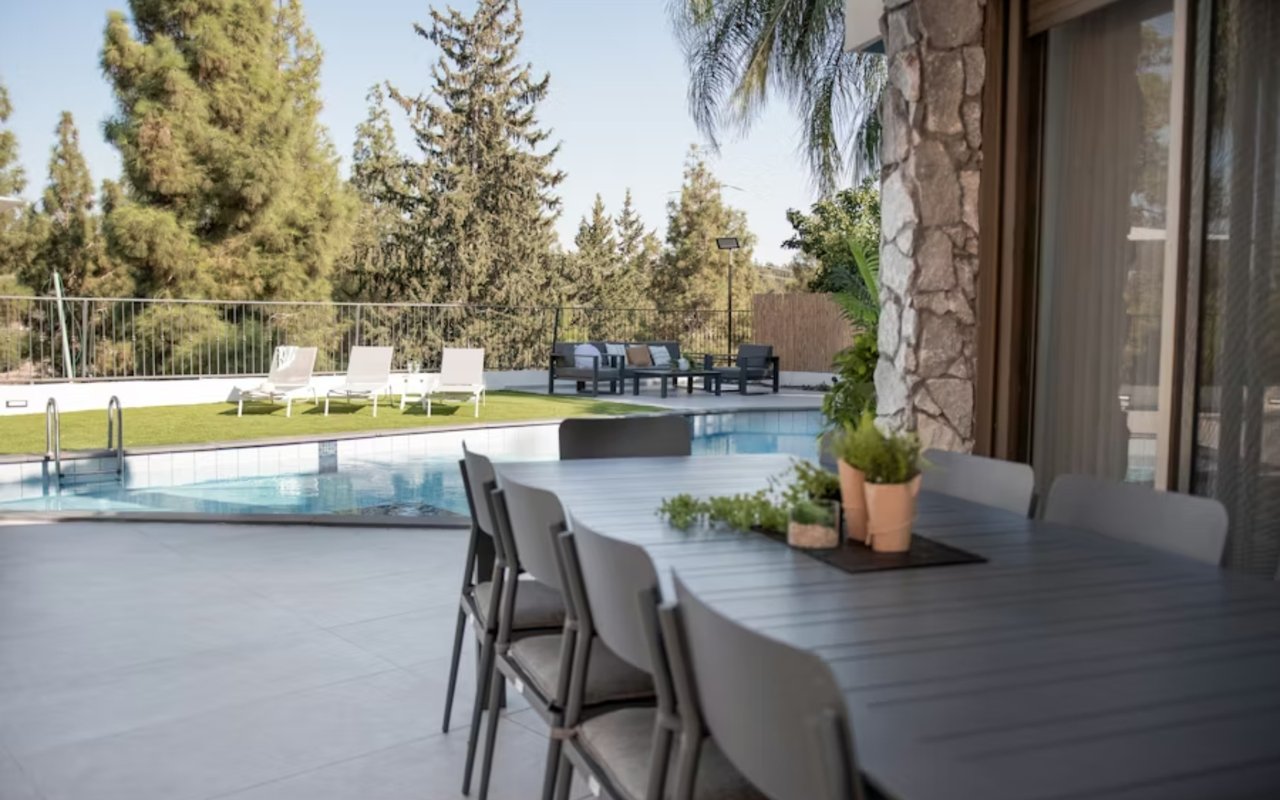
Your home tells a story through color. Every room offers an opportunity to express a different mood or function, and the way you combine hues can subtly guide how people experience each space. In Carmel-by-the-Sea, where homes often flow seamlessly from room to room, transitions between colors should feel intentional and natural.
In the living room, you may want a palette that feels inviting and open. Soft, ocean-inspired blues paired with ivory and driftwood tones can create an airy, conversational space. To add a touch of sophistication, consider deep navy or charcoal as grounding accents in textiles or furniture.
The kitchen is a place of energy and connection. Color psychology suggests that warmer hues, such as buttery yellows or soft apricots, stimulate appetite and positivity. If you prefer a modern, coastal feel, a combination of white cabinetry with sea-glass backsplash tiles and brushed brass fixtures can keep the room bright and lively without feeling too busy.
For the bedroom, calming shades like misty blue, lavender-gray, or pale sage promote restfulness. Layering different tones of the same color group — like pairing soft linens with a slightly deeper wall tone — creates depth and tranquility.
In a bathroom, cool tones often work best to evoke freshness and clarity. Soft turquoise or gray-blue tiles can make even small bathrooms feel spa-inspired. Accents of natural stone or warm wood add balance so the space doesn’t feel too cold.
If you have a home office or creative studio, color can be strategic. Research shows that greens enhance concentration, while blues boost productivity and imagination. Incorporating natural light and a hint of vibrant color — such as a coral chair or a piece of abstract artwork — can help maintain energy throughout the day.
Combining Color Psychology With Texture and Light
Color doesn’t exist in isolation; it’s influenced by texture and light. In Carmel-by-the-Sea, where the changing coastal light shifts from soft fog in the morning to golden warmth in the afternoon, paying attention to these elements can transform how your palette feels throughout the day.
Texture can change the way a color is perceived. A matte finish in pale gray might feel calm and sophisticated, while a high-gloss version of the same shade reads as modern and dynamic. Incorporating materials like linen, rattan, and stone helps diffuse light naturally and adds dimension to your color scheme. When combined with thoughtful lighting — like warm LED fixtures or soft pendant lamps — colors reveal their full emotional range.
Natural light plays an especially important role in Carmel homes. Large windows that face the sea or gardens invite in an ever-changing light that interacts beautifully with color. South-facing rooms receive abundant sunshine, making them ideal for cooler tones that balance brightness. In contrast, north-facing rooms benefit from warmer colors that bring a sense of coziness and light. The interplay of daylight and shadow adds personality to your interiors, making color psychology feel alive and dynamic rather than static.
Creating Flow Throughout Your Home
One of the challenges in home design is creating a sense of cohesion without monotony. You want each room to have its own personality, but the transitions between them should feel harmonious. In Carmel-by-the-Sea homes, where open layouts and natural views are common, this balance is especially important.
Start with a base palette — a collection of three to five colors that work well together — and repeat them in varying proportions throughout your home. For example, if you choose seafoam, ivory, sandy beige, and charcoal, you might use seafoam predominantly in the living room, beige in the kitchen, and ivory in the bedrooms, with touches of charcoal in accents and decor. This repetition ties everything together subtly.
Consider how flooring, trim, and built-in cabinetry connect each space. Keeping these elements consistent allows your chosen colors to stand out while maintaining visual continuity. Even if you decide to introduce a bold feature wall or colorful art piece, it will feel intentional within the broader scheme.
Drawing Inspiration From Carmel’s Landscape
Few places offer as much natural beauty as Carmel-by-the-Sea, and using that as your creative guide ensures your home feels authentic to its setting. The cliffs, dunes, and Pacific horizon inspire an extraordinary range of tones. Think about how early morning mist differs from sunset over the ocean and how those changes can inform your palette.
The beach offers endless inspiration: the cool grays of weathered driftwood, the soft beige of sand, and the shimmering blues of the waves. Using these as your foundation gives your interiors a timeless coastal essence. The forests that surround Carmel introduce earthy greens and rich browns, ideal for grounding more ethereal hues. If your home sits near cypress trees or gardens, bringing those deep greens inside creates continuity between indoors and outdoors.
Bringing It All Together
Using color psychology to transform your home is about more than aesthetics; it’s about designing a space that feels like an extension of who you are and where you live. In Carmel-by-the-Sea, the interplay between land, sea, and light provides endless inspiration for this creative process. Every choice, from wall color to accent detail, contributes to how your home feels and functions.
Carmel-by-the-Sea is a place where artistry and nature coexist effortlessly. Find a home in Carmel you truly love with
Scherling Properties leading the way.